Today in Parliament, Phil Goff asked John Key what he probably thought would be a hard question about the rise in inequality under National. Key responded by appealing to new data from MSD:
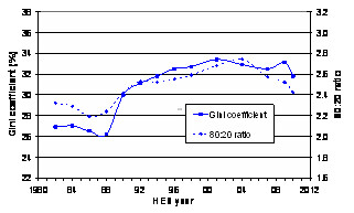
I have excellent news for the member: a very detailed scientific report on income equality actually went up on the Ministry of Social Development’s website at 2 o’clock today. It is titled Household Incomes in New Zealand. The report shows that the degree of income inequality in New Zealand, under standard measures like the Gini coefficient or the 80:20 ratio, has actually fallen in recent years. I go on to say that in fact the report shows that the distribution of income in New Zealand is more even now than it was at any time under the previous Labour Government. So I point out to the member that he is quite wrong to say the gap between the rich and the poor has been growing; in fact, it has been reducing. I urge the member to read the report.The report is available here, and its pretty obvious from even a cursory glance that it doesn't show what Key thinks it shows. Why? It's right there on the front page:
The report uses data from Statistics New Zealand’s 2009–2010 Household Economic Survey (HES) to update the previous report in the series which had information to 2009.(Emphasis added)The interviews for the 2009–2010 survey were carried out in the year to 30 June 2010, and asked about incomes in the previous twelve months.
The findings in the report capture all of the impact of October 2008 tax changes and some of the impact of the April 2009 tax changes, but none of the impact of the October 2010 tax changes.
So where Key is trying to claim this as good news for his government, he's wrong. The data used in the report is from 2008 - 2009 (12 months before the survey period), and covers the tail end of Labour's period in office. This is Labour's drop in inequality, not National's; we won't be beginning to hear about the effects of their policies until the next report in 2012.
So what does the report show? As noted, there's a mild drop in inequality, following a small uptick in 2009 - which has restored inequality to where it was in the early 90's:

The report gives two explanations for this: incomes at the bottom rose slightly, thanks to Working For Families and Labour's increases in the minimum wage. Meanwhile, incomes at the top dropped during the study period due to lower investment returns at the beginning of the recession. Since then, of course, we've had tax cuts for the rich, a 90-day trial period and other moves to stomp on wage increases for the poor, cuts to WFF, and massive increases in wealth for the uber-wealthy - so I don't think that trend of gradually declining inequality is going to last.