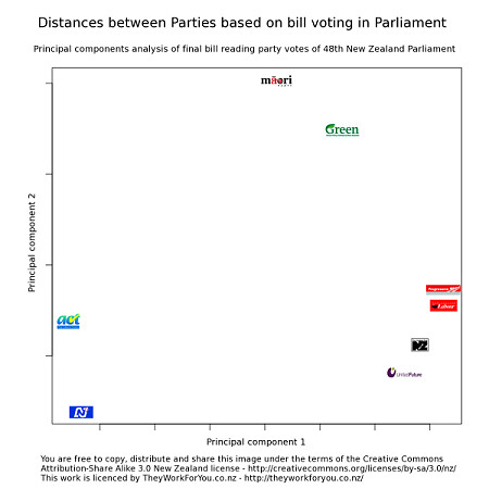
With the election only days away, blogs and the media are busy comparing the parties policy stances on various issues. Meanwhile, TheyWorkForYou.co.nz has done an impressive statistical analysis on party voting patterns. The most basic result - which parties vote most often with which other parties - can be seen in the graph below:

Rob explains:
The closer two parties are on the plot, the more often they voted the same way in final bill readings. The distances between the parties is calculated based on their votes. The axis don't have any special meaning, it's the distances between parties that explains similarity in their voting.Those positions have in part been set by confidence and supply arrangements - NZ First and United Future's voting patterns for example seem to be dictated by their agreement with the government. But the Greens and Maori Party have not been bound by such agreements, and their position reflects their independent policy stances. So what this graph tells us straight off is that these parties are likely to have far more difficulty working with National than with Labour (which itself will have been dragged towards United Future and NZ First).
There's an explanation of how the data was crunched here.


