A while ago I linked to an American article on 15 Mind-Blowing Facts About Wealth And Inequality In America, and commented that we need similar facts about New Zealand. Here's the first: a pie-chart of wealth distribution.
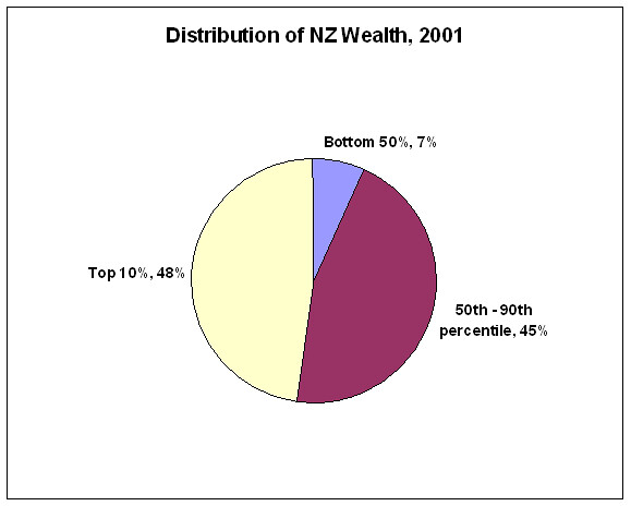
(Source: Te Ara)
It looks terrible - 50% of the population own only 7% of the wealth, while the top 10% own nearly as much as everyone else put together. But it could be much, much worse. Just look at America...
I'd like to do an income one to match that chart mapping the income of the top 1% to changes in the top tax rate - but income data is difficult to come by in New Zealand. Te Ara has historic decile shares (with an unfortunate data switch in 1981 which ruins the time series), and top tax rates (which have basically gone down, down, down) - but there seems to be no info on the top 1% or top 0.1%. If anyone can help out, I'd love to know.
