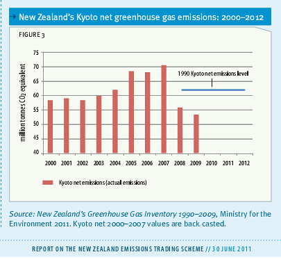
Last week, the government released its first Report on the New Zealand Emissions Trading Scheme, tracking progress in the ETS. I've blogged about the report, and its admissions of massive pollution subsidies to Methanex and New Zealand Aluminium Smelters, here. But there was one thing I didn't blog about: an interesting chart on page 3 of the report, which appears to show that we are making great progress in reducing emissions:
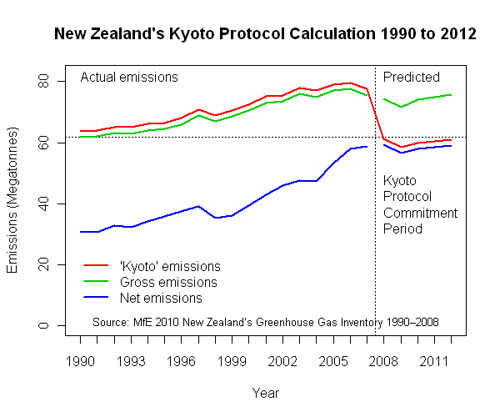
I was curious about this chart, since it doesn't match either the net or gross emissions pathways from our latest inventory report. But as Hot Topic points out, that's because it in fact mixes both, using gross emissions until 2007, and net afterwards:
While consistent with Kyoto, this is dishonest and misleading, comparing apples and oranges to give an illusion of progress where there has been none. But then, isn't that National's climate change policy in a nutshell? Pretending to do something, while really doing nothing at all.
Carbon is carbon, and so I think its perfectly appropriate to account for emissions on a net basis (provided it is done robustly, and the sinks are real, rather than bullshit). But then you should do so consistently. Mixing your data sets in this way is just juking the stats. Its not just dishonest, its also wrong.


